blue fish condos - great progress!
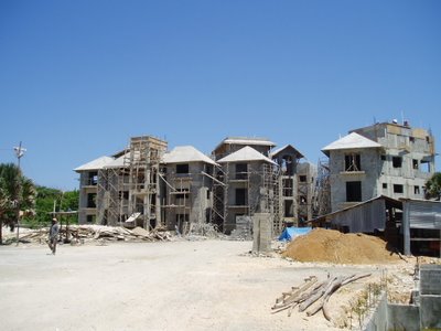
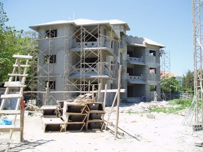
the blue fish condos are coming along nicely. the roofs are now fully over the third floor. we can see what the bedrooms will be like in our unit. it's cool - they are going to have high (cathedral) ceilings. i like the look, but it also makes the rooms feel bigger. i wish we had the same in the living room area.
it turns out that juan has decided to do the same thing with a unit in The Victorian condo complex as we requested for our unit. meaning on the top floor there in phase 2, they have combined (2) one bedrooms into a large 2 bedroom unit with an open living room/dining room/kitchen area and huge deck. curious to see how quickly that unit sells there. we are biased of course and think our unit at Blue Fish is the best one aside from the A-3 penthouse unit.
they've started to install the windows in building #3, so we now know what those will be like. while our preference would have been wood windows, they are white aluminium but actually quite nice and certainly very sturdy. in think in the end, it is indeed a better choice to go with aluminium because the salt in the air really just quickly trashes wood. we've also seen the kitchen cabinets that will be installed and like them as well. they are deciding whether to put a white wash on them, which we have not yet seen.
blue fish is going to have mexican accents, meaning it will have a mexican feel to it but will not be an outright mexican architectural design. you can start to see some of these accents in the interiors and on the exterior of the buildings. for instance, check out the terraces in this picture:
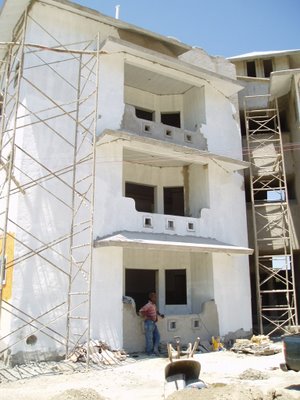
they have rounded edges and will have a solid wood beam railing across them. they are also experimenting with putting wooden beams on the ceilings of the terraces, though this is purely for aesthetic purposes and nothing functional as the ceiling is made of concrete.
the exterior colors are going to be colorful. juan and pablo are testing out different yellows and oranges. each time we go out to the blue fish condos, they have put up different colors and combinations for the exteriors and window frames in a small section on building #3. they are trying to go for a similar look to this hotel in mexico: http://www.starwoodhotels.com/luxury/search/hotel_detail.html?propertyID=1375
we are pushing for the colors to be as "earthy" as possible and not day-glo. i think it will turn out fine.
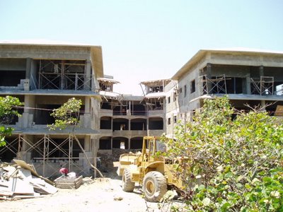
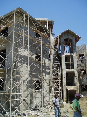
here are some more photos, showing the progress being made:

2 Comments:
Looks fabulous !!! I can hardly wait to have a libation on the deck and enjoy the scene and the balmy breezes and ocean view. ;-)
Bravo on a great investment!
How could you go wrong on that ?
Hugs,
CP
Looks like you've struck it rich !
Hello-
Do you have any recent photos of the blue fish you can publish?
We missed reading your blog...
Thank you
Post a Comment
<< Home